Phantasm Plugin by Astute Graphics

Phantasm plugin

For someone who spends as much time with Adobe Illustrator as I do, the opportunity to extend some key functionality is extremely welcome. After-the-fact color correction in particular is one of AI’s surprising weaknesses. Phantasm by Astute Graphics equips Illustrator with an awesome suite of color & lighting manipulation tools on par with Photoshop.

Illustrator’s default color tools are limited and pretty unintuitive in terms of what you can accomplish and how. Phantasm introduces a much more standardized and powerful set of options including hue/saturation, brightness/contrast, exposure, curves, and levels among others. There’s even a powerful option for creating a live halftone effect.

Like most of Astute Graphics’ plugins, it’s actually remarkable the features they contribute aren’t already native to Illustrator. Even more so in this case considering, as mentioned, the Phantasm color toolset is pretty standard.

Regardless, and also like most of Astute Graphic’s plugins, Phantasm is an extremely welcome addition. It doesn’t just extend Illustrator’s default capabilities it adds new ones that not only accelerate certain tasks, but enables you to do things that would be almost impossible otherwise. If not technically “impossible” then beyond tedious at the least.

Phantasm (and Astute Graphics plugins in general) are time savers, streamlining processes and tasks that are otherwise labor intensive. They’re very liberating, allowing for much more creative freedom on projects. Reducing time consuming, tedious processes to mere clicks affords artists like myself the opportunity to tap into an exciting new range of possibility.

As an artist obsessed with color, the hue/saturation feature alone has been a gift. Previously shifting color en-mass was an awkward process. You could “Recolor Artwork” but it was a clunky proposition. The rest of Illustrator’s default color tools are a series of independent sliders and settings that feel unnecessarily restrictive.

I’ve used a handful of AG plugins and Phantasm is one of my favorite, and most relied on. If you spend a significant amount of time in Adobe Illustrator I’d highly recommend checking out Astute Graphics plugins.

They can be a little pricey considering they’re extensions to features that quite frankly should be native to Illustrator at this point. However, if you pick and choose the one’s you’ll find most useful for your workflow, they’ll pay for themselves with how much time they save. I’ve found them to be indispensable.
Color!

I love color. That’s probably obvious. Color is an intense, emotionally visceral experience. I don’t think we really appreciate the sensuous quality of color very often. Beautiful and vivid hues are such a simple uplifting pleasure. The sensory appeal of color is definitely something that informs my work as an artist.

As part of my art, it’s a process, a distraction, and a point of contention. On every project it’s something I both get to enjoy, and have to contend with.

I think Monet knew what he was talking about when he described color as “…my daylong obsession, joy, and torment.” While it’s much easier to create, mix, and experiment with color on a computer, the speed and simplicity just mean the infinite possibilities loom with even more overwhelming proximity.

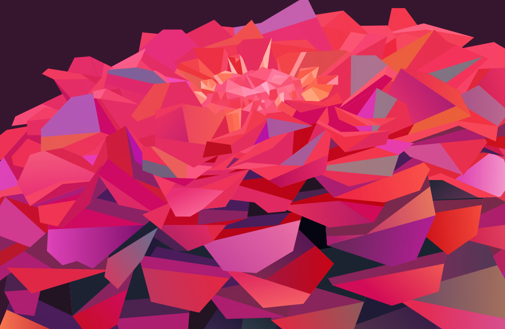
colorful flower vector art

The reason most of the pieces I do have multiple versions is a result of my enjoyment and indecision. It’s just too much fun working with with the colors alone, but it’s also a creative vacuum without convenient resolution.

After The primary design/illustration work is done, I’ll usually start experimenting with the palette. It’s at this point the design usually extrapolates into several different iterations. Limiting it to 2-3 is the hard part (you should see my art boards).

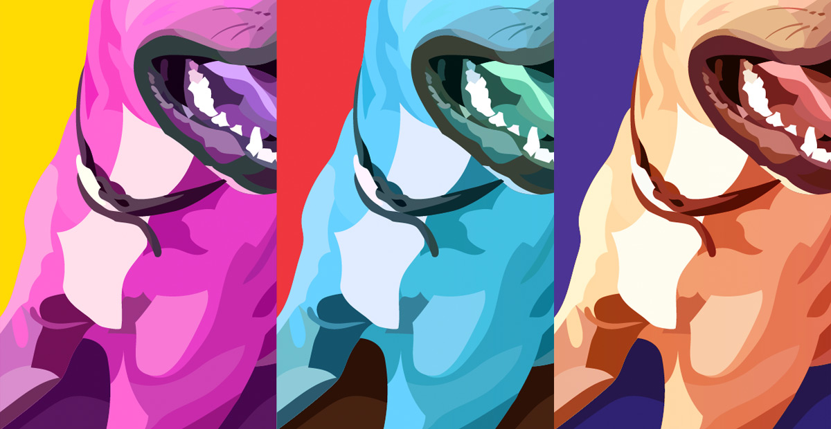
colorful vector art

Most of the time I end up with about 10-12 versions before narrowing the field. I never want to take away from a design itself by releasing so many versions that the multitude distracts from the individuality. I do like the idea of doing series however. Exploring a single work through the lens of color allows me to expand on it and satisfy the need for more.

I actually love subdued or minimal color, as well as more natural, earthy palettes but I can never resist dialing them up to a hyper-saturated level. Once I do I usually end up with a few I just can’t do without.

I also really appreciate what other artists are doing with color, particularly Georgina Vinsun and Scott Naismith. I’ll probably do a post about inspirational artists at some point, but will save that for some other time.

New Series

New Series

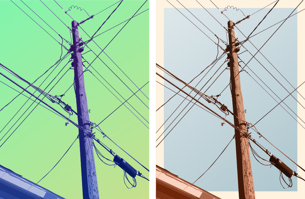
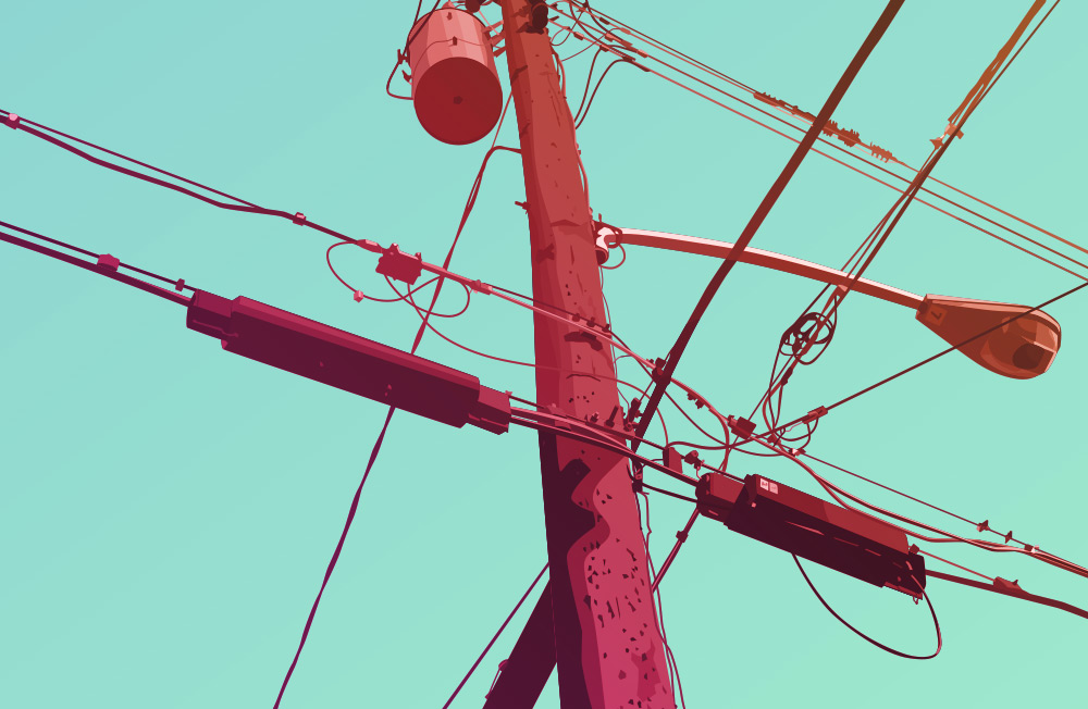
In expanding my technique and working on some new ideas I’ve started a series of pieces based on telephone poles. Sort of a subject matter exploration I guess.

The concept has a sort of photographic inspiration. The idea of focusing on something mundane or completely innocuous to find its unique character is something that seems to have its roots in photography. I’m interested in this approach to subject matter for some of the same reasons but also because I’m obsessed with color and shape.

The idea of taking a seemingly boring subject, focusing on shape and space and stylizing it with color is an approach I’ll never exhaust. Telephone poles are repetitious but also varied. They have a lot of cluttered detail as well as some interesting pattern and geometry in the lines themselves. I’d considered making this a silhouette series similar to the Buds series but found the detail too compelling and the illustrative look too much fun.

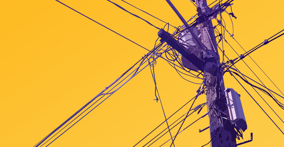
telephone poles artwork 1

I decided each piece would be represented two ways. One colorized, but a bit more realistic in hue and background and another more vivid color combo. I honestly can’t decide which is my favorite look.

As with pretty much every design I do, the hardest part is limiting the final design to these two versions. I get sucked into the process of colorizing the designs. There are so many really interesting combinations, it’s always hard to settle on a favorite, but it’s usually better to limit how many final versions you end up with.