Artists I Like: Octavi Navarro

art feature octavi navarro

Pixel art is a thoroughly modern form of artistic expression and one of my favorite emerging styles. Born from both a nostalgia for the early digital age of the 80’s and 90’s, as well as the indie game scene, it is a love letter to a beloved era and the culture that grew from it.

Conveying the essence of a scene with minimal detail is nothing new. Impressionism and mosaic have done this for centuries. There is something truly unique, however, about the characters and scenes brought to life with these bright little bits.

There is a delightful sense of imagination and whimsy in pixel art, that stirs fond memories of technologically simpler days.

But even within the seemingly limited scope of tidy pixelated columns, various artists find ways to bring their style to this most geeky of art forms. More or less pixels, increased or decreased detail, varying amounts of colors…the results are surprising.

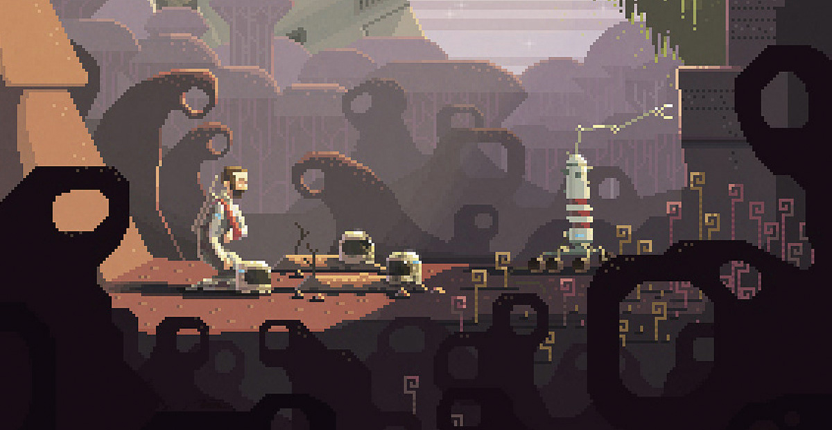
Over the past year I’ve been coming across the work of Octavi Navarro’s. A self styled pixel artist and gamer, his designs are iconic for several reasons. He embraces the cultural vibe of the medium with richly detailed, delightfully eccentric depictions that evoke a spirit of adventure and wonder.

He doesn’t simply lean on pixelazation as a stand alone gimmick. Instead he builds upon it with stylistic choices that compliment the rudimentary beauty of the medium, imbuing it with additional layers.

He employs stylish 45 degree angles within blocky compositions. There is an overarching geometry at work. Complex scenery and detailed minutia are overtly framed in boxy architectural cross-sections, a hallmark of his style.

This wonderful structural dissection allows the viewer to glimpse the colorful inhabitants of a besieged castle, a creaky mansion, or lonely lighthouse. His works are often visual compilations, whimsical tableaus informed by fantastic fiction and popular mythology.

Embracing the inherent nerdiness of pixel art, he creates scenes culled from the collective consciousness of geek culture. Though occasionally drawing from actual characters and settings his works are just as often merely familiar amalgams of established lore. They exist in the periphery of classic tales and science fictions, inhabiting the shared universe of our imagination.

They can be a slice of American mythos, or a surreal expedition on an alien world, a ride in steampunk dirigible or a plunge into the icy depths in an iceberg submersible. Wonderfully eccentric mise en scenes, they conjure images of Jules Verne or pulp adventure comics.

Part of the challenge of the medium is properly conveying lighting, texture and detail within the unforgiving constraints of a few simple pixels. Navarro’s work is impressive in it’s understanding and representation of these key nuances.

Whether it’s the soft glow of a dim bulb or the fading brilliance of a sunset, his lighting creates incredible depth and ambiance. Likewise his use of details, whether it’s colorfully pixelated hieroglyphics, or footprints in the snow attribute life and texture to the rudimentary bits.

Like any style, pixel art has extraordinary range and potential that continues to surprise and inspire me. As a child of the 80’s, and a lifelong gamer, I have a great affection for the unique technological subculture that continues to inspire this movement.
Two New Pieces in the Shop

New Faceted Series

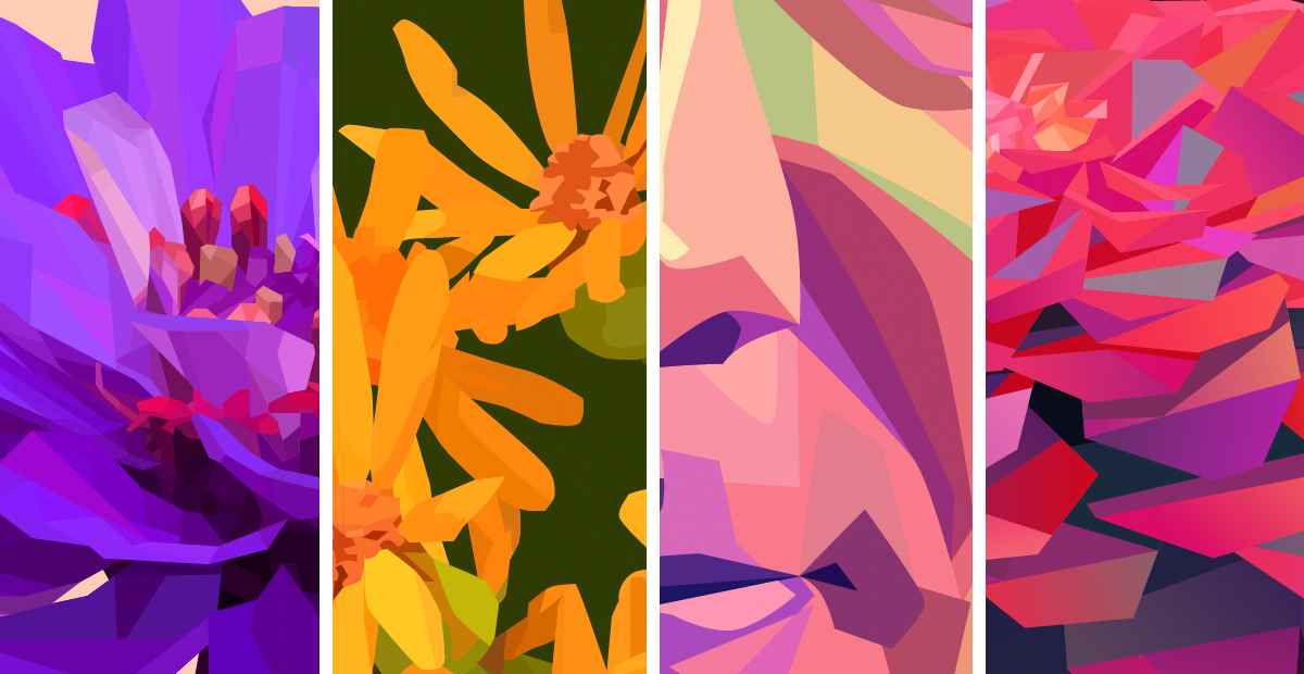
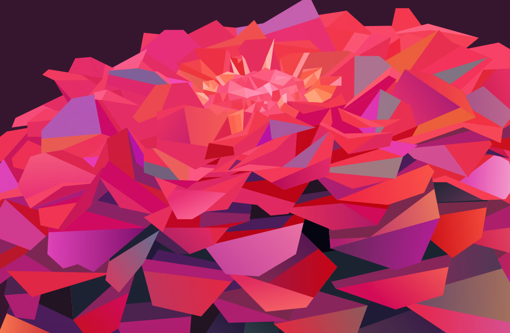
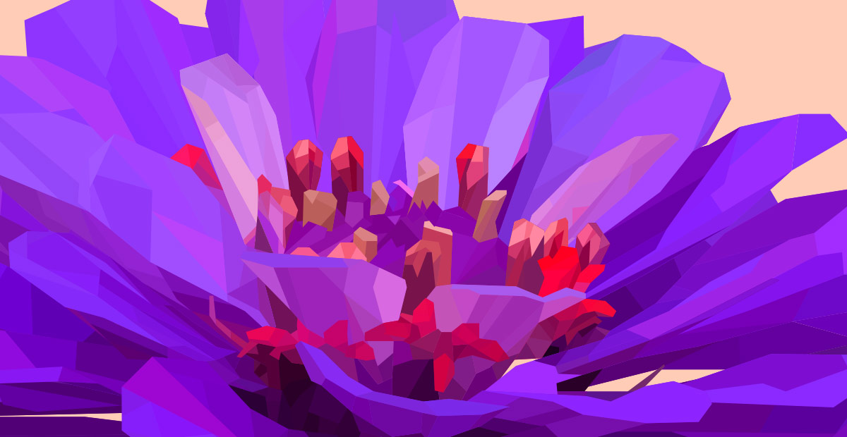
Faceted – Purple, and Faceted – Red are now available in the gallery and on my shop at fineArtAmerica.com.

I’m dubbing this new series “Faceted” though that term could be applied to almost everything I do. They actually started as separate projects but were similar enough I decided to group them this way.The styles were actually approached differently with Red being a bit more experimental and off the wall in terms of the color strategy. Purple on the other hand has more subdued contrast. The purest in me really prefer series to have a consistent approach to style. Though the idea of grouped pieces having a similar but unique take on a theme is very intriguing.

I have another in the works, as I think you really need at least three to qualify as a “series”. 

New Work

Upcoming artwork

Haven’t posted in a while, and needed to pop back in. I have plenty in the works including several new pieces that should be up on the site over the next few weeks. As with most of the pieces I create I’m having trouble knowing when to stop. I’ have a few I’ve been playing around with for over a year and at this point I may have more on deck than I do on the site.

I have a new series in the works and some other ideas I’m considering. More flowers and color, but I’ll also be getting into some new styles and subject matter here soon. I may start sharing more WIP’s and maybe do some tutorials or posts on my process. We’ll see.

New Series: Pop Art Portraits

Pop Art Self Portrait

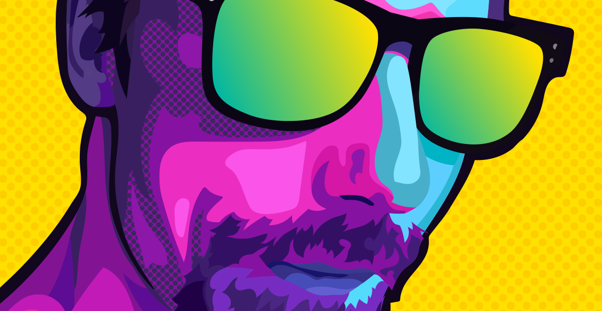
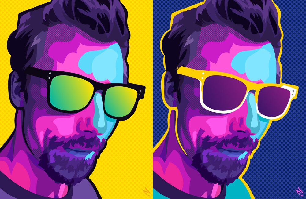
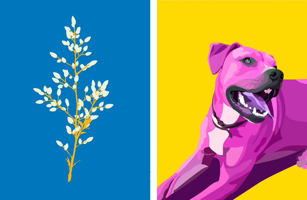
There are so many styles I want to try. This is a good place to start. This is the first of a series of Pop Art portraits I’m working on. There are some general rules I’m following to keep these consistent but I may deviate a little on each and will probably revisit them all when I’m done to unify the look.

Pop Art Self Portraits

Pop Art is an interesting concept with a lot of room for creative diversion. I’m not sure whether or not I’m really attracted to the style as it’s traditionally represented but the concept of color, contrast, and lively subject matter combined for deliberate impact is definitely something that appeals to me.

I don’t see myself concentrating on Pop Art over the long term but definitely think I’ll incorporate some of its inspiration into my style going forward.

Color!

I love color. That’s probably obvious. Color is an intense, emotionally visceral experience. I don’t think we really appreciate the sensuous quality of color very often. Beautiful and vivid hues are such a simple uplifting pleasure. The sensory appeal of color is definitely something that informs my work as an artist.

As part of my art, it’s a process, a distraction, and a point of contention. On every project it’s something I both get to enjoy, and have to contend with.

I think Monet knew what he was talking about when he described color as “…my daylong obsession, joy, and torment.” While it’s much easier to create, mix, and experiment with color on a computer, the speed and simplicity just mean the infinite possibilities loom with even more overwhelming proximity.

colorful flower vector art

The reason most of the pieces I do have multiple versions is a result of my enjoyment and indecision. It’s just too much fun working with with the colors alone, but it’s also a creative vacuum without convenient resolution.

After The primary design/illustration work is done, I’ll usually start experimenting with the palette. It’s at this point the design usually extrapolates into several different iterations. Limiting it to 2-3 is the hard part (you should see my art boards).

colorful vector art

Most of the time I end up with about 10-12 versions before narrowing the field. I never want to take away from a design itself by releasing so many versions that the multitude distracts from the individuality. I do like the idea of doing series however. Exploring a single work through the lens of color allows me to expand on it and satisfy the need for more.

I actually love subdued or minimal color, as well as more natural, earthy palettes but I can never resist dialing them up to a hyper-saturated level. Once I do I usually end up with a few I just can’t do without.

I also really appreciate what other artists are doing with color, particularly Georgina Vinsun and Scott Naismith. I’ll probably do a post about inspirational artists at some point, but will save that for some other time.

New Series

New Series

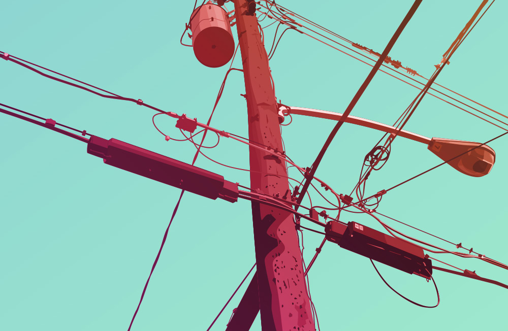
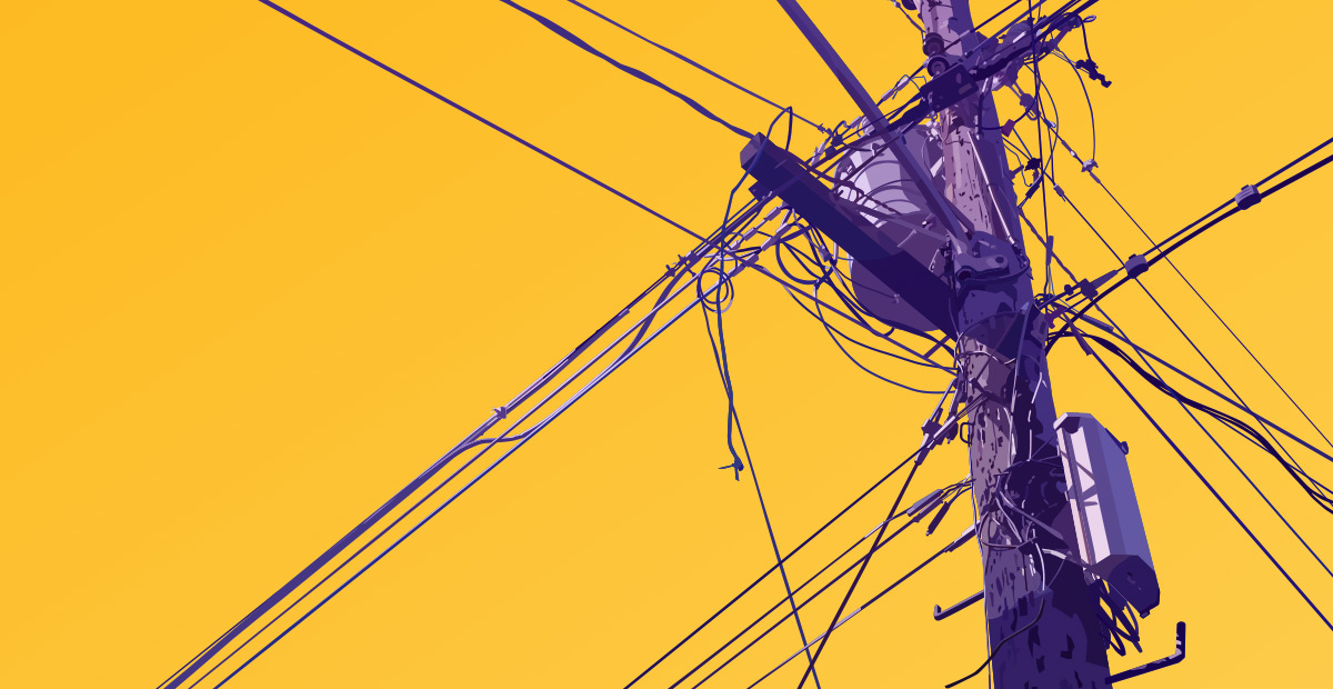
In expanding my technique and working on some new ideas I’ve started a series of pieces based on telephone poles. Sort of a subject matter exploration I guess.

The concept has a sort of photographic inspiration. The idea of focusing on something mundane or completely innocuous to find its unique character is something that seems to have its roots in photography. I’m interested in this approach to subject matter for some of the same reasons but also because I’m obsessed with color and shape.

The idea of taking a seemingly boring subject, focusing on shape and space and stylizing it with color is an approach I’ll never exhaust. Telephone poles are repetitious but also varied. They have a lot of cluttered detail as well as some interesting pattern and geometry in the lines themselves. I’d considered making this a silhouette series similar to the Buds series but found the detail too compelling and the illustrative look too much fun.

telephone poles artwork 1

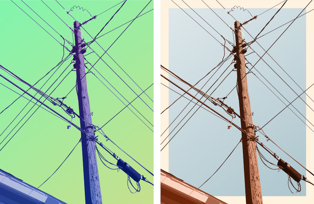
I decided each piece would be represented two ways. One colorized, but a bit more realistic in hue and background and another more vivid color combo. I honestly can’t decide which is my favorite look.

As with pretty much every design I do, the hardest part is limiting the final design to these two versions. I get sucked into the process of colorizing the designs. There are so many really interesting combinations, it’s always hard to settle on a favorite, but it’s usually better to limit how many final versions you end up with.