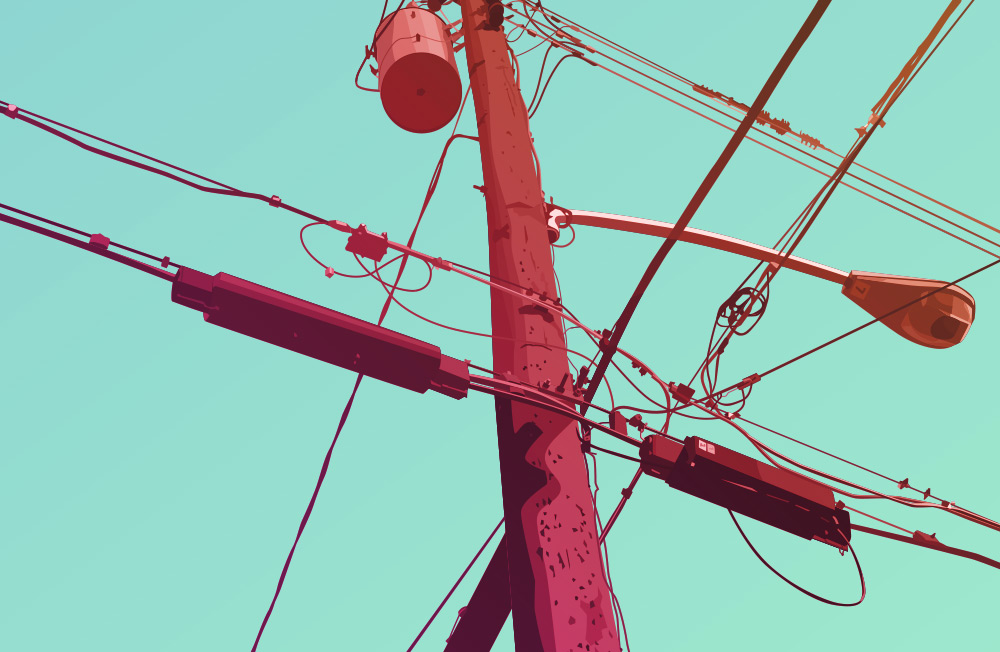
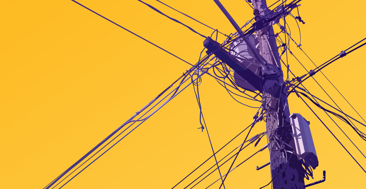
I love color. That’s probably obvious. Color is an intense, emotionally visceral experience. I don’t think we really appreciate the sensuous quality of color very often. Beautiful and vivid hues are such a simple uplifting pleasure. The sensory appeal of color is definitely something that informs my work as an artist.
As part of my art, it’s a process, a distraction, and a point of contention. On every project it’s something I both get to enjoy, and have to contend with.
I think Monet knew what he was talking about when he described color as “…my daylong obsession, joy, and torment.” While it’s much easier to create, mix, and experiment with color on a computer, the speed and simplicity just mean the infinite possibilities loom with even more overwhelming proximity.
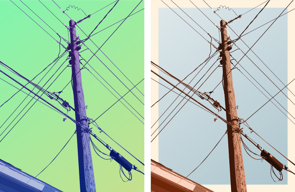
The reason most of the pieces I do have multiple versions is a result of my enjoyment and indecision. It’s just too much fun working with with the colors alone, but it’s also a creative vacuum without convenient resolution.
After The primary design/illustration work is done, I’ll usually start experimenting with the palette. It’s at this point the design usually extrapolates into several different iterations. Limiting it to 2-3 is the hard part (you should see my art boards).
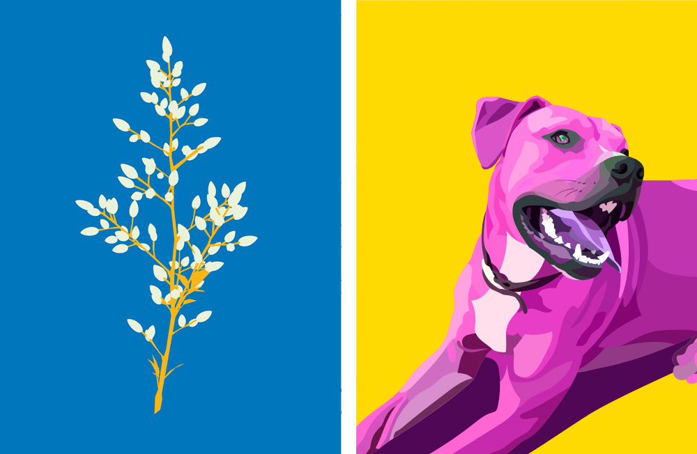
Most of the time I end up with about 10-12 versions before narrowing the field. I never want to take away from a design itself by releasing so many versions that the multitude distracts from the individuality. I do like the idea of doing series however. Exploring a single work through the lens of color allows me to expand on it and satisfy the need for more.
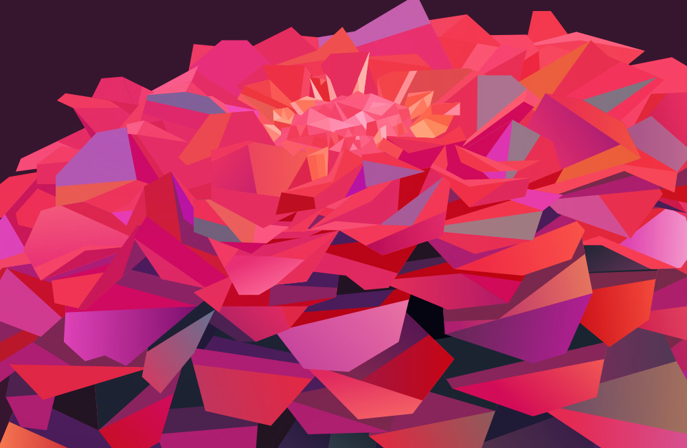
I actually love subdued or minimal color, as well as more natural, earthy palettes but I can never resist dialing them up to a hyper-saturated level. Once I do I usually end up with a few I just can’t do without.
I also really appreciate what other artists are doing with color, particularly Georgina Vinsun and Scott Naismith. I’ll probably do a post about inspirational artists at some point, but will save that for some other time.
