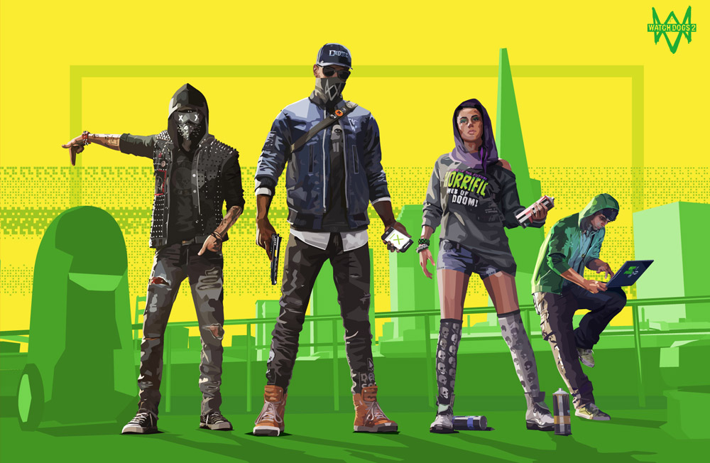
Watch Dogs 2 Fan Art – Complete

watch dogs 2 fan art

Finished these up in time for the launch of Watch Dogs 2 a few weeks ago. These character features are based on an official image of the game’s featured protagonists. I did this for fun but have really enjoyed creating them. This style is a looser interpretation of the intentional facetted geometry of some of my previous floral work.
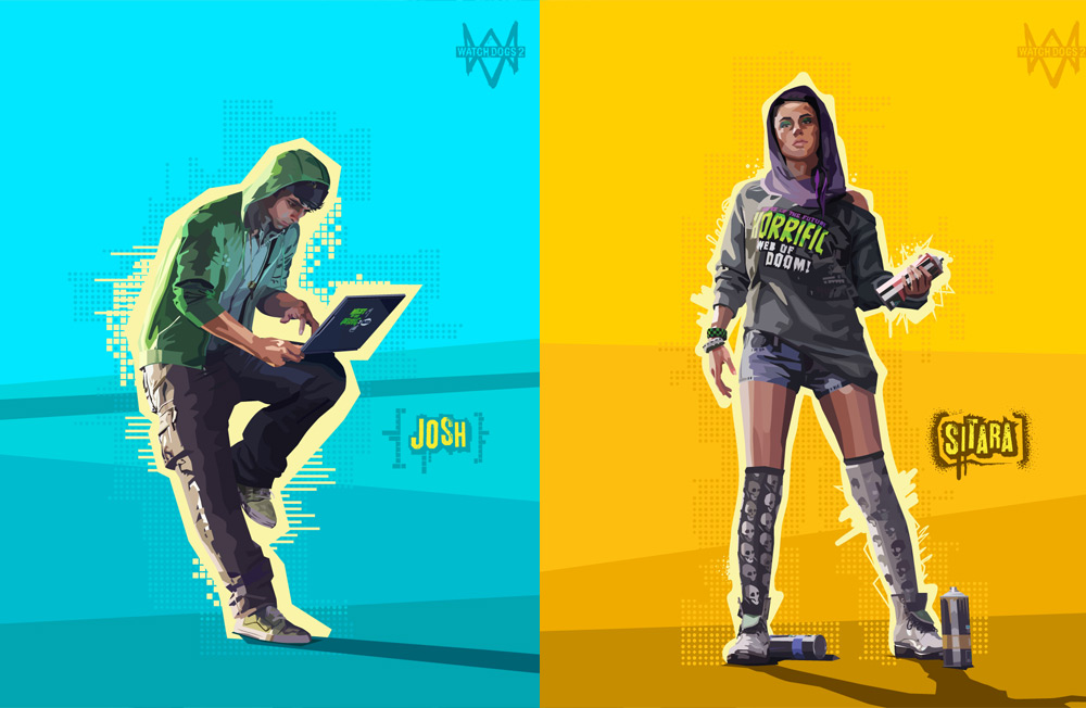
watch dogs fan art. Josh and Sitara.

The style deviates in that instead of strictly observing straight-angles and limited points in each individual vector, it uses curves and nodes as needed. I still defaulted to straight lines though, using curves only once the arc reached a certain threshold. The resulting style is something angular, but unkempt, almost grungy and even a little more painterly. I like it.
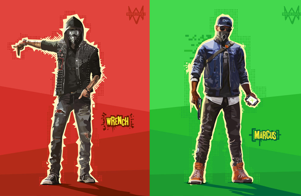
watch dogs fan art. Wrench and Marcus.

As I mentioned in my previous post, game studio Ubisoft has emphasized art (in particular, digital and street) within the aesthetic of Watch Dogs 2. The game UI and the world itself is imbued with a distinct maker culture and geek art vibe. As a fan of the series these were fun to create as a homage leading up to the game’s launch.
New Series

New Series

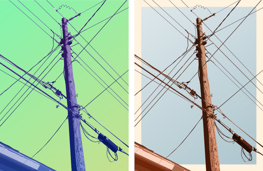
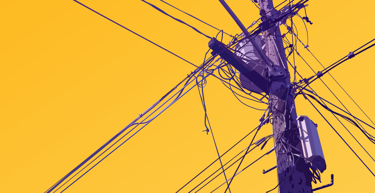
In expanding my technique and working on some new ideas I’ve started a series of pieces based on telephone poles. Sort of a subject matter exploration I guess.

The concept has a sort of photographic inspiration. The idea of focusing on something mundane or completely innocuous to find its unique character is something that seems to have its roots in photography. I’m interested in this approach to subject matter for some of the same reasons but also because I’m obsessed with color and shape.

The idea of taking a seemingly boring subject, focusing on shape and space and stylizing it with color is an approach I’ll never exhaust. Telephone poles are repetitious but also varied. They have a lot of cluttered detail as well as some interesting pattern and geometry in the lines themselves. I’d considered making this a silhouette series similar to the Buds series but found the detail too compelling and the illustrative look too much fun.

telephone poles artwork 1

I decided each piece would be represented two ways. One colorized, but a bit more realistic in hue and background and another more vivid color combo. I honestly can’t decide which is my favorite look.

As with pretty much every design I do, the hardest part is limiting the final design to these two versions. I get sucked into the process of colorizing the designs. There are so many really interesting combinations, it’s always hard to settle on a favorite, but it’s usually better to limit how many final versions you end up with.